The content on this page is specific to its time and is no longer current. This page is kept for archival purposes only, and the contents may be safely disregarded.
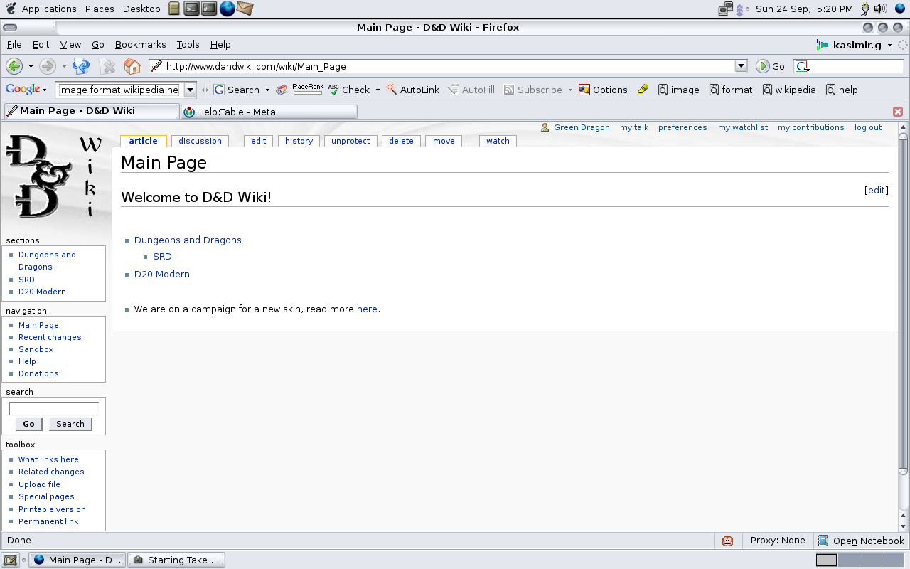
D&D Wiki is currently on a campaign for a new skin. Our current submissions are listed below, and we hope that everybody gives a good effort and creates a skin that gives definition to D&D Wiki.
More information about skins can be found on MediaWiki. All of these skins can be tried out by changing your user preferences.
If you have a skin that you would like to add to this list, please contact Green Dragon.
MonoBook:[edit]
| Skin name: |
MonoBook
|
| Description: |
The default skin for MediaWiki.
|
| Screen shot: |
|
| Votes for: |
|
| Votes Against: |
|
| User comments: |
|
Submission by Sledged:[edit]
| Skin name: |
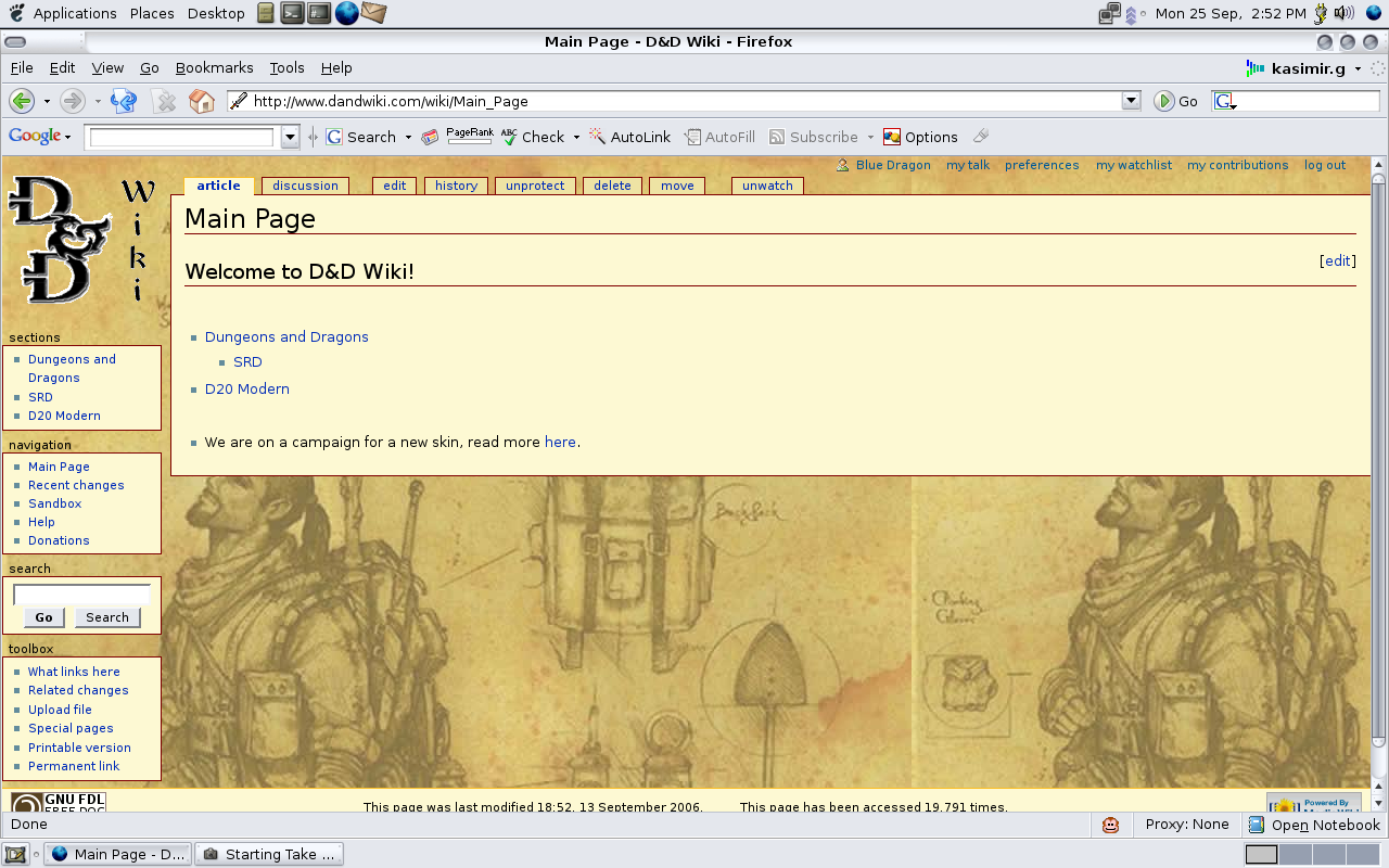
Sledged
|
| Description: |
Working skin candidate for D&D Wiki (suggestions more than welcome)
|
| Screen shot: |
|
| Developer Comments: |
Presently in phase 1: Color Scheme and background images.
Below are the elements that are still using the original monobook colors. Many of these, I have no idea in what pages and under what circumstances they come into play. It's possible that the over the course of the development of MediaWiki that some of these might not be even in use anymore.
| text
|
links
|
borders
|
backgrounds
|
- #contentSub
- .documentByLine
- editing comments (.autocomment)
- "This is only a preview" (.previewnote)
- .editExternallyHelp
- li span.deleted, span.history-deleted
- .revision_saved
- #searchTarget ul li:before
|
- external links (.external)
- my talk preferences my watchlist my contributions log out (#p-personal li a)
- interwiki links (a)
- visited interwiki links (:visited)
- visited interwiki links to non-existant pages (.new:visited)
- interwiki links to non-existant pages (.new)
- active interwiki links (:active)
- .stub
|
- active tab (#p-cactions li.selected)
- fieldset
- pre
- user notification (.usermessage)
- inner thumbnail box elements (div.thumb div)
- .townBox
- .portlet h6
- #footer
- #preftoc li (right border only)
- #userlogin .captcha
- .gallery
- .gallerybox div.thumb
- .editExternally
- #mw_trackbacks
- .noarticletext
- #searchTarget
|
- user notification (.usermessage)
- background colors for diff views
- new lines (td.diff-addedline)
- removed lines (td.diff-deletedline)
- point of reference lines (td.diff-context)
- .portlet h6
- .not-patrolled
- .updatedmarker
- .newpageletter
- .minoreditletter
- .mw_metadata td
- .revisionform_focus
- .revision_tr_default
- .revision_tr_first
- #mw_trackbacks
- #allmessagestable th
- #allmessagestable tr.orig
- #allmessagestable tr.new
- #allmessagestable tr.def
- #searchTarget
- div.townBox dl dd
|
Next phases: layout, font
—Sledged 16:10, 26 September 2006 (MDT)
|
| Votes for: |
I believe that this is the first skin that actually makes users understand the instant that they come to D&D Wiki that this is a website about Dungeons and Dragons, and it takes it away from the generic look of Wikipedia. I will give my vote for this skin. --Blue Dragon
I think that this skin is much better than the other one it adds flavor which D&D Wiki is lacking in! I Give my vote to this skin! --Gold Dragon
I vote for! --Pz.Az.04Maus 12:05, 29 September 2006 (MDT)
|
| Votes Against: |
|
| User comments:
|
Coming Along But Not Complete[edit]
I believe that this skin is not yet fully complete. There are many issues with it (some of the items on this site do not fully have the new look, for example this "wikitable"), but it is coming along wonderfully. It would be good if it had its own logo as well. --Blue Dragon 14:46, 25 September 2006 (MDT)
- Took me a while to figure this one out. By default, "wikitable" is not in the same CSS as most everything else. So any values I use that conflict with the wikitable CSS get ignored, because common.css (the file that specifies wikitable) is imported after the skin CSS. Unfortunately, the only way I know to change this is to hack the file <skins/common/common.css> where the wiki is installed (which, to the best of my knowledge, only Blue Dragon and Green Dragon can do), or to just use a completely different table all together. I suppose I could create "dndwikitable" for just such a purpose. —Sledged 12:54, 28 September 2006 (MDT)
- Thanks for letting me know what was causing this problem. I have removed the content from common.css and added it to main.css of MonoBook. Sledged currently now uses its own code for tables. Sorry for the problems, --Green Dragon 21:03, 28 September 2006 (MDT)
- It kinda feels a bit bland, but is alright as far as looking like a book goes... --Pz.Az.04Maus 11:52, 29 September 2006 (MDT)
- I think one thing that would help is to have a background image for the article blocks. I tried using the one I suggested in Talk:Main Page, but it looked horrible. If anyone has a copy of the Tome of Magic or Tome of Battle, I think something like the watermark they use in those books on the table of contents would be good, or perhaps the d20 logo as a watermark.
- The Tome of Magic or Tome of Battle watermarks would look much better than the D20 Logo. --Green Dragon 18:12, 1 October 2006 (MDT)
Edit Page Buttons[edit]
Custom images for the row of buttons in the edit pages should probably be created, too. —Sledged 16:10, 26 September 2006 (MDT)
Link Colors[edit]
I definitely think there could be a better selection for link colors on this skin. Anyone have any suggestions? Here are the current colors:
- external links <-- an image with different colors should be used, too.
- my talk preferences my watchlist my contributions log out
- interwiki links
- visited interwiki links
- visited interwiki links to non-existant pages
- interwiki links to non-existant pages
- active interwiki links
—Sledged 11:39, 28 September 2006 (MDT)
- I do not like the strange colors. Please get rid of them, and return them to the normal colors. Thanks. --Green Dragon 09:29, 30 September 2006 (MDT)
- These are the normal colors. That is they are the default colors monobook uses. I haven't yet figured what the colors should be for the new skin. The tricky part is finding the right colors that stand out without clashing. It's proving a bit harder than I anticipated. —Sledged 13:06, 30 September 2006 (MDT)
- Oh... I guess if it really makes the skin better got for it, the only problem is I do not like my links non-normal colors... Hope it is not a problem. --Green Dragon 19:01, 30 September 2006 (MDT)
- That's ironic. I've never liked the blue and purple links ever since I started using web browsers. For a while I made it standard proceedure to change the default link colors whenever I installed a browser on my computers. I've since become used to them (mostly because I've gotten to lazy to go through the effort of changing them), but I still don't like'em. —Sledged 20:31, 30 September 2006 (MDT)
- Oh. I have always liked how they look, they have just become normal for me. Anyway, if you can make the colors more D&D Oriented please change them. --Green Dragon 10:50, 1 October 2006 (MDT)
|

